
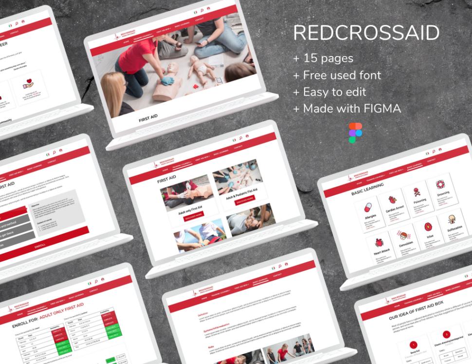
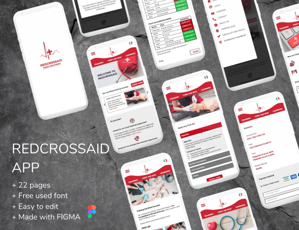
RedCrossAid Webpage+App

About Project
CASE STUDY
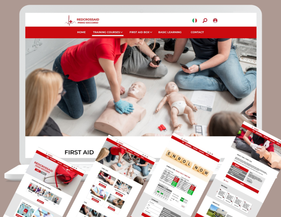
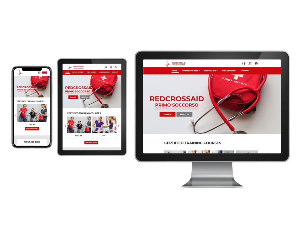
The product: RedCrossAid is a company that provide first-aid courses, they commit to create something unique and useful for all user, with a Website and an App that allow people to have access to free basic knowledge of the subject, and more useful feature.
Project duration: January 2022 to February 2022
The problem: Lack of an App that give a full experience of the fist-aid course, and lack of Websites that give you access to free knowledge of the subject.
The goal: Create an App and Website, build to be able to help user with different need, paying certified course, free basic knowledge, emergency numbers, first aid kit at home etc…
My role: UX designer, UX researcher, from conception to delivery.
Responsibilities: Conducting interviews, paper and digital wire framing, low and high-fidelity prototyping, conducting usability studies, accounting for accessibility, and interacting on design.
Summary:I conducted interviews and created empathy maps to understand the user I’m designing for and their needs. A primary group found useful to have an App that will teach the basic knowledge of first aid with either free access to material or paying certified courses.
The feedback received through research made it very clear that users would be interested in online studies because of lack of time, and impossibility to attend in presence.
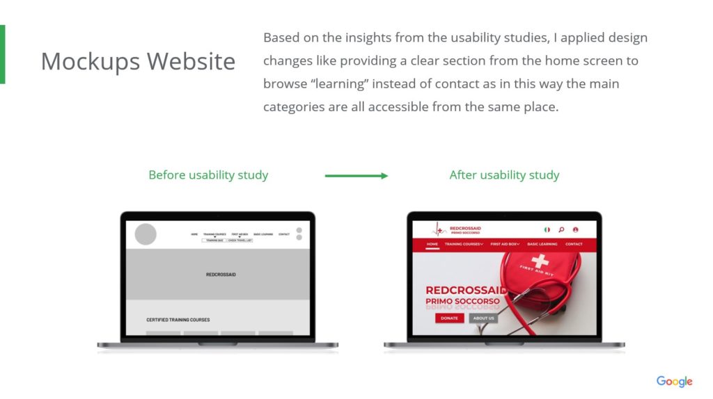
Based on the insights from the usability studies made it on the Website, I applied design changes in the menù, giving a more clear and readable look, and by adding an icon for searching content inside the website.
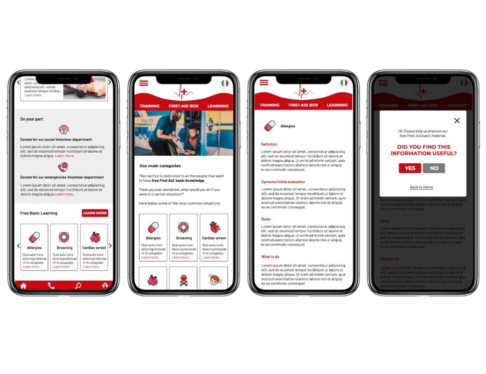
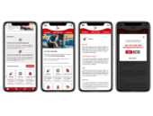
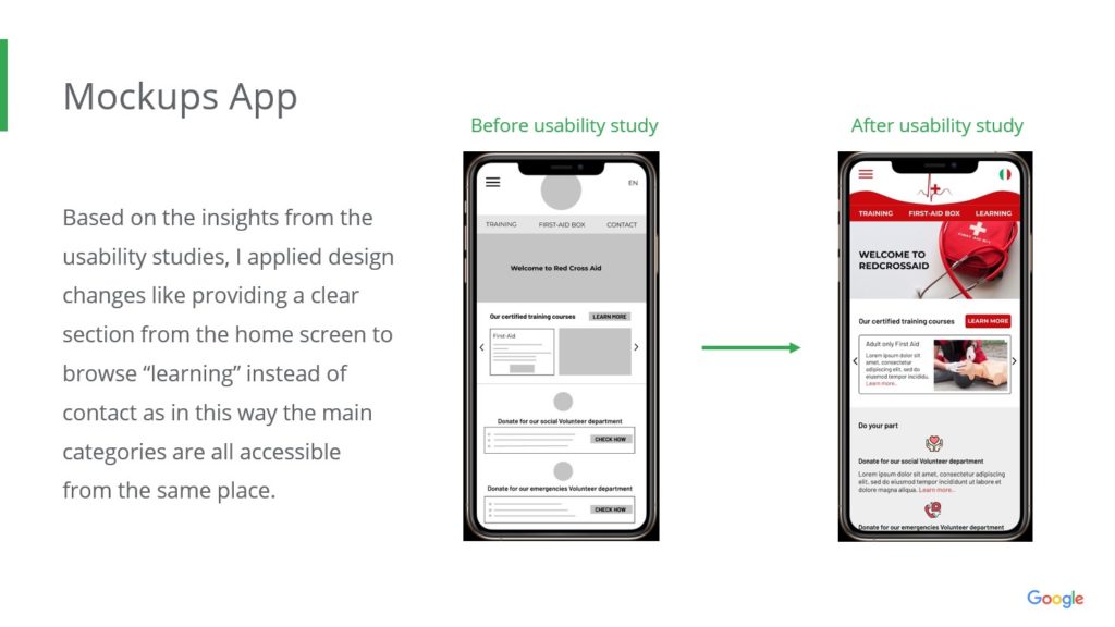
Based on the insights from the usability studies made it on the App, I applied design changes like providing a clear section from the home screen to browse “learning” instead of contact as in this way the main categories are all accessible from the same place
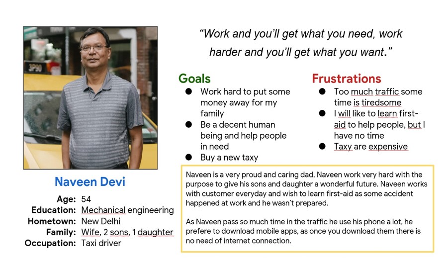
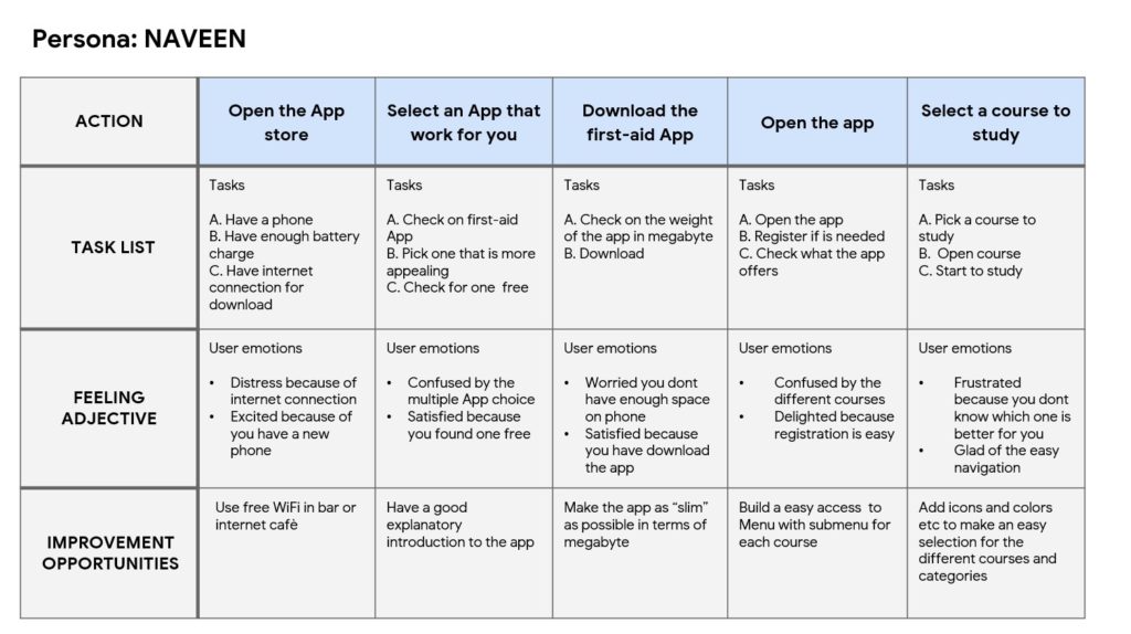
PERSONA 1: Naveen Devi
Problem statement: Naveen is a full time taxy driver who needs to learn first aid because he work with customer every day and wants to be able to help if is needed.
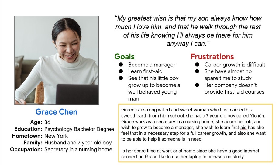
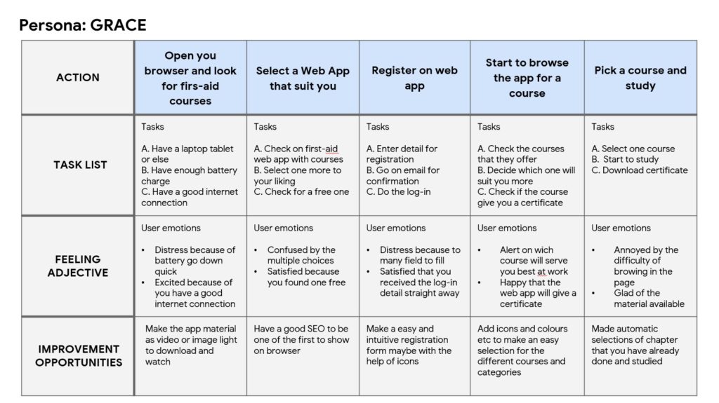
PERSONA 1: Grace Chen
Problem statement: Grace in a secretary in a nursing home who needs to be able to give first-aid help because she works with elderly people that might need help.
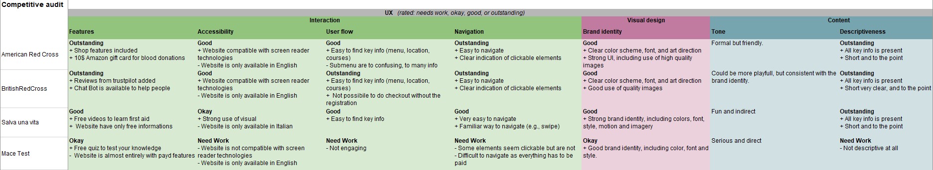
Competitive audit: An audit of a few competitor’s products provided direction on gaps and opportunities to address with the RedCrossAid App.
Usability study: findings
From this usability study I found loads of suggestion for improve the App and Website by adding different kind of customization that will definitely be useful to reach a more broad range of people .
1 User suggested to change the name of “Pharmacy” section, and make the use of it more clear.
2 User found the “Basic Learning section not self explanatory and need more info.
3 Empathize the registration form with a pop up overlay
Naveen User Journey Map
Grace User Journey Map
Accessibility considerations
1 Provide access to users who are vision impaired through adding alt text to images for screen readers.
2 Used icons to help make navigation easier.
3 Used detailed imagery for each ingredient available to help users better understand the design.
Impact: The Website and the App makes user feel like RedCrossAid is the right choice if you want to learn about Fist Aid and more.
One quote from peer feedback: “Overall the App is useful and with more info will be very good, it is functional, nice and funny, I also like the idea that you can do Quiz”
What I learned: I learned that even though the problem I was trying to solve was a big one, diligently going through each step of the design process and aligning with specific user needs helped me come up with solutions that were both feasible and useful.
Location
Milano
Date
February 1, 2022
Category
UX Design